Extremely cursed UI at neverwinter.fandom.com/wiki/Ring_of_Warding
It is now possible to like the fact that someone has liked something on facebook #indieweb #ui #likeception

Twitter observation: shared, known bounds allow for the communication of infinity
Spotted on google.com: people searches return rich contact data in autosuggest box:
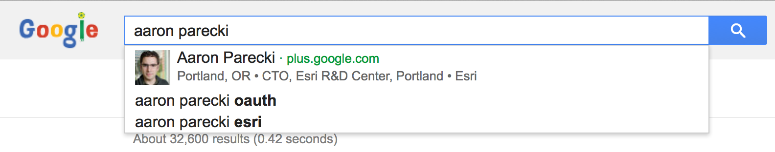
Predictably, it only works for people with Google+ data.
Turns out that selecting that option and pressing return doesn’t navigate to aaronpareki.com, or even a Google+ page, but adds a weird state indicator and a “this option does not exist” warning:

(just in case anyone’s wondering, the reason I was searching was to attempt to reproduce this)
 Barnaby Walters
Of course the more significant thing is UI considerations: how to offer this info to the downloader, how to explain what the various possible outcomes mean and what action the user should take as a result of them
 Aitor García Rey
@_aitor “apps/repositories” not specific or user-focused enough to base improvements/requirements on — what is the data being *used* for, in terms of the people using the UIs you want to build?
E.G. do you want people to be able to search based on ingredient(s)? Or find only recipes which can be made within time available? Or to offer a UI to convert quantities into units the cook is more familiar with? Or to scale quantities depending on the number of people the cook is making food for?
Rather nice detail on fitbit.com profile page editing view, allowing quick mock-changing of audience. UI like this gives people confidence and safety, provided it is truthful.

Exposing protocol-relative URLs is an odd choice — I suspect that is accidental, but would be pleasantly surprised if not.
Mac OS 10.6 spaces vs 10.9 full-screen apps/desktops — switching gestures a welcome addition, but muscle memory persistent “physical” location lost, replaced by ambiguous time-based UI which does exactly what you mean half of the time, and causes flow-breaking confusion+excise the rest of the time
Idea for focus-maintaining anti-rabbit-warren UI: “current task” bar, simple user-editable text field present on all screens, subdued but not inconspicuous, persistent reminder of current short-term goal.
Should be somewhere out of the way but accessible at a glance, i.e. only eye movement required to see what it is. Key combo to instantly clear and focus for editing.
Playing with Yahoo Pipes for the first time. This is the UI I’ve been dreaming of for years. The data sources are bogged down with nasty RSS/ATOM semantics, but that’s mostly irrelevant. The important things:
- Live, context-sensitive debugging. Want to know what the data looks like at a particular point in the graph? Click there. What if I change this parameter? It updates. WHY ARE PEOPLE NOT RAVING ABOUT THIS? THIS IS HUGE!
- All parameters are programmable, but with the ability to specify defaults
- Everything is declarative — not only textually, but visually.
- One-click publish and deploy, with facilities to create basic UI and pre-fill it
- Ability to clone and reuse pipes — each pipe is a module you can use in other pipes. Take someone elses pipe and view source, change it, reuse it.
I made a Pipe to convert #microformats2 h-feed/h-entry markup into RSS from scratch in about 15 mins, having never used the tool before (bear in mind also that this is not a tool built for consuming mf2 data structures): Convert Microformats to RSS. The tiny feedback loop the Pipes tool provides, both in deploying, sharing and debugging, enabled Tantek Çelik to find a bug in his site’s markup.
Again: WHY DOES NO-ONE KNOW ABOUT THIS? If it’s because processing stodgy, outdated, DRY-violating formats is its bread and butter, fair enough. Let’s rebuild this with microformats2.
Is a website a web app if I keep on trying to open it using Spotlight? “Launching a browser” is flow-breaking indirection.
”Back to the Future is a movie, not a UI pattern”
LOL. Tantek Çelik on pagination directionality, a pet peeve of mine. TUMBLR WHY U GO THE WRONG WAY?
Aaaand the prize for most useless #ui control of the day goes to… arionbanki.is!
It’s a “down” button which, when pressed… scrolls down. Then disappears.
[slow claps]

Choice paralysis, or, bad distress signal design:
One wonderful project which could really use some design work is www.gutenberg.org, especially the distributed proofreaders system — I can’t imagine just how many people want to contribute but are put off by the incomprehensible #ui
@benwerd I use markdown for initial authoring purely for speed, esp. when typing on mobile devices. After that I just edit the HTML. I’ve yet to come across a WYSIWIM editor which satisfied my semantic, well-structured HTML needs, any suggestions?
@scottjenson RE google maps, I hear you. This particular problem could be solved by an app which remembers your speed, then displays the concentric rings. It assumes internet access/cached maps, GPS data and a device capable of displaying it — what if the device transmitting the information was a pedometer/similar which knows my speed but not location, has no internet access or way of displaying maps?
I’m a fan of more ambient approaches like this because they enhance my own senses (in this case my poor sense of timing) without trying to run my life, as apps seem to want to do. I see it as a fundamentally different approach; apps make me perform a task and give me output. Ambient information enhances my senses and gives me more context within which to make decisions.