 Aaron Parecki
@aaronpk and accepting a reply from the same UI :) This calls for cake — going to have a go at those cookie recipes you posted!
 Igor Wiedler
@igorwhiletrue thanks! I was aware of stackphp/run, but wondered if there was an alternative which left the run method in place — Silex is such an exquisitely designed and concise abstraction it’s a pity to have to give that up and introduce extra packages, namespaces and functions (more surface area to learn and remember).
Spent the evening at a dj. flugvél og geimskip concert, which, for those who have not witnessed this genius at work, looks and sounds something like this:
Completed FEZ and now all I can think about is OWLS WITH TENTACLES
I’m not sure I agree that a good designer ensures that the users of a design can figure out how it works (have an effective conceptual model) — rather they should ensure that it’s easy to have a conceptual model which is sufficient for the user to achieve their goal, and that more accurate information is available for tinkerers who want to have a better understanding.
Case in point: in order to use an electrical appliance, it’s enough to have an intuitive yet inaccurate conceptual model of plug sockets and electricity (“it flows from the hole down the tube to the appliance”). Only in order to build or otherwise tinker with such appliances is it necessary to know that the direction of the electricity changes 50-60 times a second.
Update: this was actually clarified later in the course
 Joschi Kuphal 吉
@jkphl hm that’s an interesting case — href is technically a url-potentially-surrounded-by-spaces, question is whether or not it’s php-mf2’s responsibility to strip out the spaces in u- properties. I’d say it is, as those spaces are never going to be useful data which we’re throwing away, so opened an issue.
@jkphl great work! There are a few different scenarios, indiewebcamp.com/authorship covers some e.g. follow rel=author and parse for h-card. There are some other heuristics in use like looking for author on h-feed (e.g. my homepage), not yet documented but should certainly be in the spec.
papaparse.com is a fantastic jQuery plugin for reading CSV files in #js — perfect for tiny feedback loop live previews of file uploads
@benwerd chain emails spreading works of art? That’s a new one on me. Sounds like fun!
#listening to NASA + CC-licensed ambient music youarelistening.to/nasa @ Vísar HQ #spaaace
Recurring post-snowden meme: bunch of guys put up a shiny vaporware site claiming to fix everything if you subscribe to their mailing list.
“Protect your privacy by giving us your email address!”
How about instead you actually build something post news about the stuff you’re building on the web, where I can browse it over Tor without giving you (or more likely a third party) a bunch of information about myself.
Beginning experimentation with tipping UIs: added BTC and DOGE tipping links to homepage with rel-payment and experimental u-x-payment, documented a bunch of tipping UI examples on microformats.org/wiki/payment-examples
 Anna Debenham
@anna_debenham indeed — know of anything similar for design?
 Glenn Jones
@glennjones great stuff! Replying seamlessly via your action element :) #webactions #indieweb
A Confusing Signifier Corrected: Nutrition Information
The nutrition information given on this packet of delicious Baklawa is a confusing and badly designed signifier. Take the example of someone with Type 1 Diabetes who needs to carb count their meals. They have to look on the back of the box
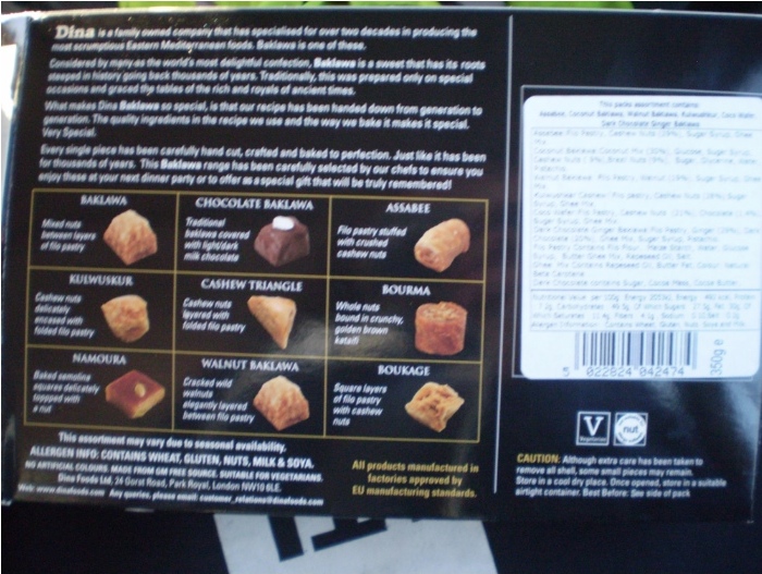
and peer at a badly printed label with hideous typography and punctuation
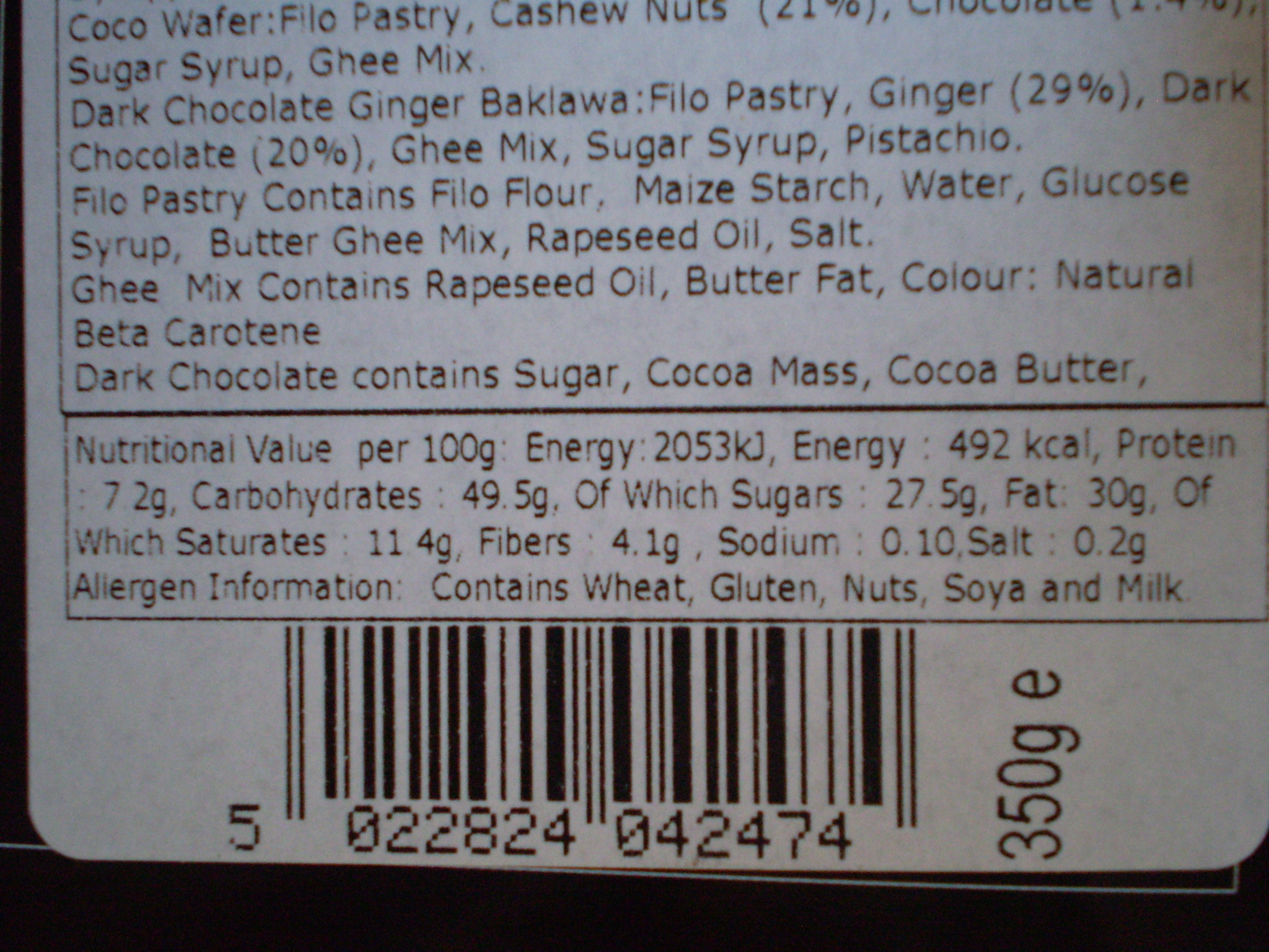
only to be rewarded with a value of 49.5g per 100g of serving. Turning the box sideways informs us that there’s approximately 350g total.
Despite the obvious difficulty of accessing the information (especially, say, in low light at a family dinner), there’s a more subtle problem here — that whilst the quantities given are perfectly valid and probably over-precise, the frames of reference and comparison (“per 100g out of a 350g packet”‚ don’t match up in any way to the eater’s mental model of the packet, which looks something like this:
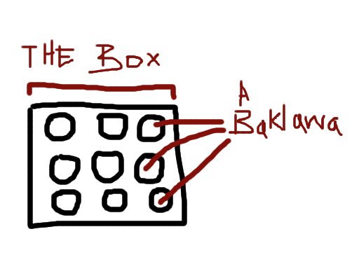
In practice, no-one eats an entire box of Baklawa, so the only unit which is meaningful to the eater is the per-Baklawa carbohydrate count, which could be expressed clearly and concisely on the packet

This could be placed on the front or the back, that’s not important — what is important is making it robustly readable in varied conditions, and matching the user’s cognitive model to minimise effort spent decoding the information.
Because people with diabetes shouldn’t have to do maths as a punishment for enjoying Baklawa.
#design #nutrition #diabetes #udacity #design101
Rather nice detail on fitbit.com profile page editing view, allowing quick mock-changing of audience. UI like this gives people confidence and safety, provided it is truthful.

Exposing protocol-relative URLs is an odd choice — I suspect that is accidental, but would be pleasantly surprised if not.
Availability is more valuable than time. As such it should be respected more, and dealt out/guarded more carefully.
First #indieweb package derived from indiewebify.me code: indieweb/rel-me for consuming the rel-me microformat and verifying silo backlinks. Perfect for implementing an indieauth.com clone in #php…
Managed to get hold of some proper bufala mozzarella from Piccolo Italia — looking forward to trying it out on a pizza!
Initial Fitbit Flex vs Nike Fuelband impressions
The Flex’s long battery life, water resistance and sleep tracking allows it to stay on my wrist pretty much constantly, meaning I never forget to put it on. Their web UI is quite nice, and the syncing process is adequate. It’s stupid that the only get at the data on the device is to sync with an iDevice or upload it to their silo and look at (admittedly rather nice) graphs, but that’s a known bug with these devices (which Aaron Parecki has written at length about.)
The Fuelband can be quite painful to put on if the catch pinches skin, its display is nice, and the fact that it doubles up as a watch which automatically syncs timezone with my computer is pretty great. Their web UI is fairly horrible (doesn’t work at all on Firefox due to JS errors), complete with Nike product advertising and confusing comparison charts.
“Nike Fuel” is a singularly useless unit. I’m imagining the reasoning behind it was something like this:
- Our USP is measuring “all kinds of activities” instead of just steps
- Calories would express this just fine, but we can’t trademark something which already exists, or copyright numbers, and database rights (which might not even cover this — ?) only exist in Europe
- Let’s come up with some new unit which is incompatible with our competitors’ products! In order for it to mean anything to anyone, they’ll have to be able to compare their score with other peoples scores, meaning they have to buy Nike products too!
If this is true, I question Nike’s motives — helping people become more active or using vendor lock-in and social manipulation to sell as many devices as possible.
Obviously it’s the second one, but Fitbit exhibit no such problems and seem to be doing okay. Everything is relative.
Both devices are rubbery wrist straps which can make clothing a little bothersome, but presumably that positioning helps them gain more accurate results as opposed to, say, a belt clip.
I’ve been unable to adequately compare the accuracy of either product. The Fuelband seems to think I’ve done far fewer steps than the Flex, but as I can’t get numbers off the Flex quickly it’s difficult to compare the two. One way would be to actually count how many steps I do one day, and see which device is closer.
I’m looking forward to continuing to use both devices, hopefully beginning to follow in Aaron’s footsteps (no pun intended) and pull the data in to my own site.