The medium with which you choose to express a message shapes that message — be careful it doesn’t contradict it.
Case in point: A Rational Web Platform (via @brucel)
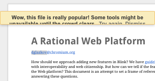
- hosted on google silo
- long complex ugly URL
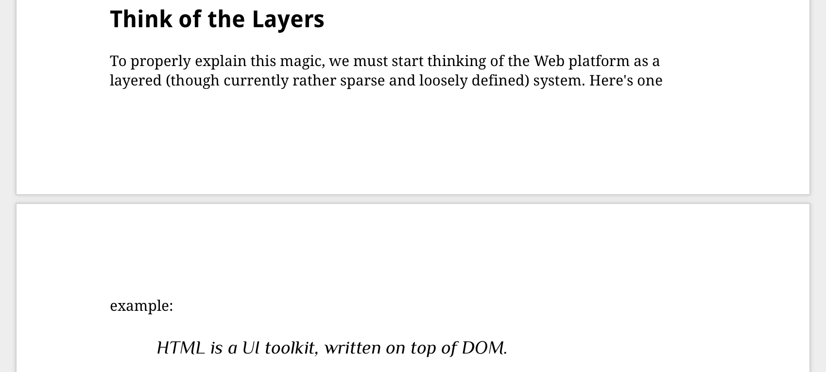
- presentation tied to paged dead-tree media with ugly results:

- no author URL, just corporate silo email, and email != web
- javascript required
- no microformats2 or even semantic HTML
articlemarkup — even js-generated markup is predictably disgusting
- Redirecting to different (non-canonical? difficult to tell due to ugliness) URL due to large amounts of traffic, likely indicative of infrastructural problems or incorrect medium
- Broken on mobile devices:

Everything about this is anti-web, practically screaming “ignore me”.
Improvements:
- Host on personal site or project commons with CC license
- Short, consistent, readable URI
- Static semantic HTML with microformats2 h-entry for easy citations, archival and replying, no JS required — this would also solve infrastructural problems as HTML is pretty easy to serve and much faster than JS-rendered DOM-heavy
“documents”applications - Author attributed by name+personal (non-silo) URL, with profile photo/logo for quick human association