1. I’m not sure I agree that a good designer ensures that the users of a design can figure out how it works (have an effective conceptual model) — rather they should ensure that it’s easy to have a conceptual model which is sufficient for the user to achieve their goal, and that more accurate information is available for tinkerers who want to have a better understanding.

    Case in point: in order to use an electrical appliance, it’s enough to have an intuitive yet inaccurate conceptual model of plug sockets and electricity (“it flows from the hole down the tube to the appliance”). Only in order to build or otherwise tinker with such appliances is it necessary to know that the direction of the electricity changes 50-60 times a second.

    Update: this was actually clarified later in the course
  2. A Confusing Signifier Corrected: Nutrition Information

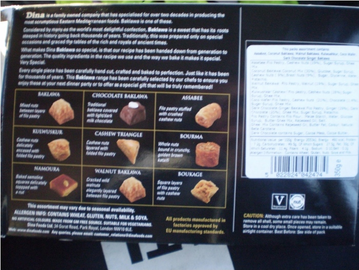
    The nutrition information given on this packet of delicious Baklawa is a confusing and badly designed signifier. Take the example of someone with Type 1 Diabetes who needs to carb count their meals. They have to look on the back of the box

    and peer at a badly printed label with hideous typography and punctuation

    only to be rewarded with a value of 49.5g per 100g of serving. Turning the box sideways informs us that there’s approximately 350g total.

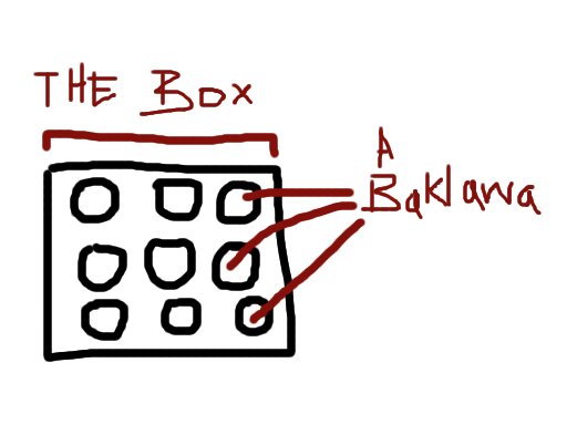
    Despite the obvious difficulty of accessing the information (especially, say, in low light at a family dinner), there’s a more subtle problem here — that whilst the quantities given are perfectly valid and probably over-precise, the frames of reference and comparison (“per 100g out of a 350g packet”‚ don’t match up in any way to the eater’s mental model of the packet, which looks something like this:

    the entire box is considered as a frame of reference, and each individual baklawa is a single unit.

    In practice, no-one eats an entire box of Baklawa, so the only unit which is meaningful to the eater is the per-Baklawa carbohydrate count, which could be expressed clearly and concisely on the packet

    with a small graphic representing the packet, with one item within highlighted in a colour, and the per-item carb count next to the graphic in the same colour.

    This could be placed on the front or the back, that’s not important — what is important is making it robustly readable in varied conditions, and matching the user’s cognitive model to minimise effort spent decoding the information.

    Because people with diabetes shouldn’t have to do maths as a punishment for enjoying Baklawa.

  3. Understandable and Confusing Design

    This treble recorder is an example of understandable design. For various reasons it’s separated into three parts and has to be assembled before usage, but a consistent decrease in diameter and significantly differently sized joints for both ends leave no ambiguity about how it should be assembled.

    On their own the parts are unbalanced with exposed unpolished joints. Assembling the instrument creates a balanced, visually consistent object, and a sturdy interference fit gives the user extra confidence that the device is ready for use.

    This Icelandic bus timetable is an example of confusing design, due to the inconsistent usage of colour and direction. The grids of times must be read top to bottom then left to right, contrary to most western languages. The yellow blocks (expressing at what intervals between the given times each bus leaves) are not strongly associated with the durations above them, and from a distance, the pairs look much like times themselves.