Reasons not to assume everyone uses a traditional green-on-black terminal:
This label on @derickr’s site is equally valid advice for both form fields :)
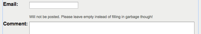
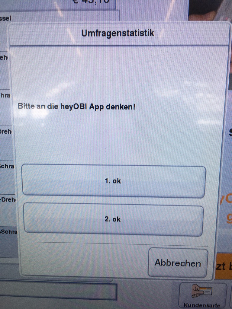
The gestalt principle of proximity rejects your internet comments! “Please leave blank, your comment will not be posted. Don’t type nonsense in though, that would be a waste of both of our time”
I love @allofbach but the website is not at all optimised for actually listening to/learning about the music. A potential redesign removes extraneous clicks and puts the focus completely on the music and performance:
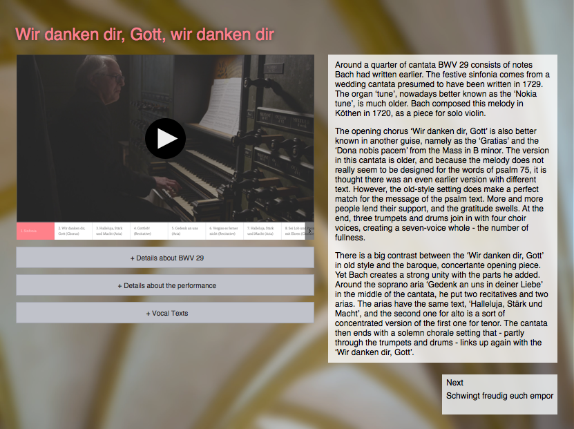
Additional possible improvements: link to wikipedia article, IMSLP page (e.g. BWV243)
Alternative, smaller, simpler #taproot logo based on super-helpful feedback from Aaron Parecki, Brian Suda, Brennan Novak, Kartik Prabhu:
I kept the multi-stranded green connection as I couldn’t find a single green which looked effective on it’s own, and the whole thing was so much flatter without the extra depth they give.
Also, an alternative version with randomly truncated segments – symbolising sites with different #indiemark levels all interacting happily
which was worth a try, but I think it lacks balance. Probably going to stick with the first one.
Some beautiful visualisations of the process of type design: typesupply.com/news/2013/9/the-development-of-balto cc @briansuda
I’m not sure I agree that a good designer ensures that the users of a design can figure out how it works (have an effective conceptual model) — rather they should ensure that it’s easy to have a conceptual model which is sufficient for the user to achieve their goal, and that more accurate information is available for tinkerers who want to have a better understanding.
Case in point: in order to use an electrical appliance, it’s enough to have an intuitive yet inaccurate conceptual model of plug sockets and electricity (“it flows from the hole down the tube to the appliance”). Only in order to build or otherwise tinker with such appliances is it necessary to know that the direction of the electricity changes 50-60 times a second.
Update: this was actually clarified later in the course
 Anna Debenham
@anna_debenham indeed — know of anything similar for design?
A Confusing Signifier Corrected: Nutrition Information
The nutrition information given on this packet of delicious Baklawa is a confusing and badly designed signifier. Take the example of someone with Type 1 Diabetes who needs to carb count their meals. They have to look on the back of the box
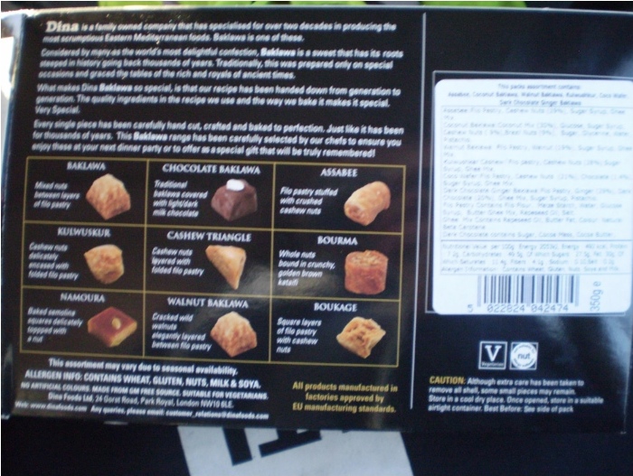
and peer at a badly printed label with hideous typography and punctuation
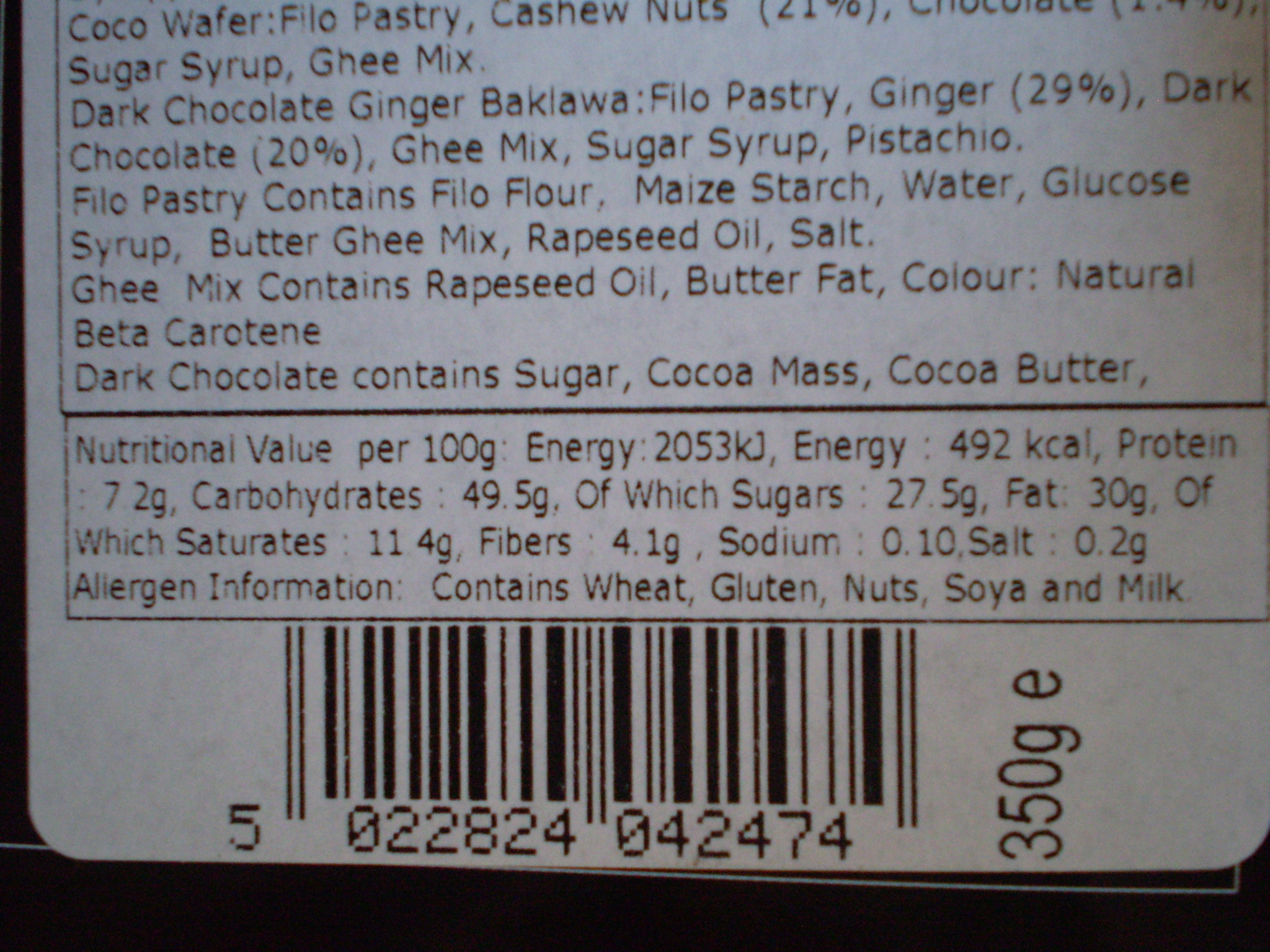
only to be rewarded with a value of 49.5g per 100g of serving. Turning the box sideways informs us that there’s approximately 350g total.
Despite the obvious difficulty of accessing the information (especially, say, in low light at a family dinner), there’s a more subtle problem here — that whilst the quantities given are perfectly valid and probably over-precise, the frames of reference and comparison (“per 100g out of a 350g packet”‚ don’t match up in any way to the eater’s mental model of the packet, which looks something like this:
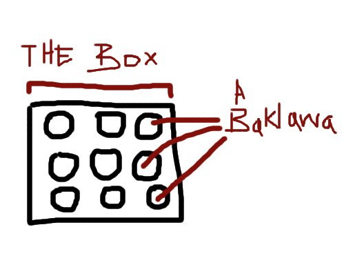
In practice, no-one eats an entire box of Baklawa, so the only unit which is meaningful to the eater is the per-Baklawa carbohydrate count, which could be expressed clearly and concisely on the packet
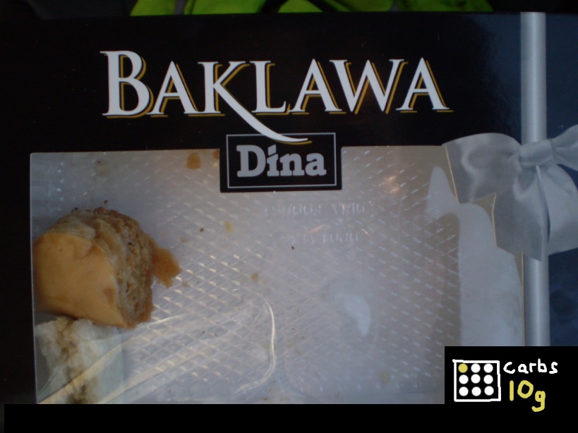
This could be placed on the front or the back, that’s not important — what is important is making it robustly readable in varied conditions, and matching the user’s cognitive model to minimise effort spent decoding the information.
Because people with diabetes shouldn’t have to do maths as a punishment for enjoying Baklawa.
#design #nutrition #diabetes #udacity #design101
Bad Gauge Design
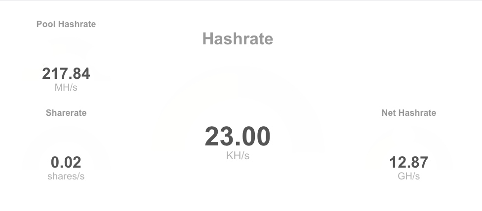
Compilation of some sub-optimal gauge design I’ve come across recently. First up is BBC iPlayer’s speed tester+comparison tool:
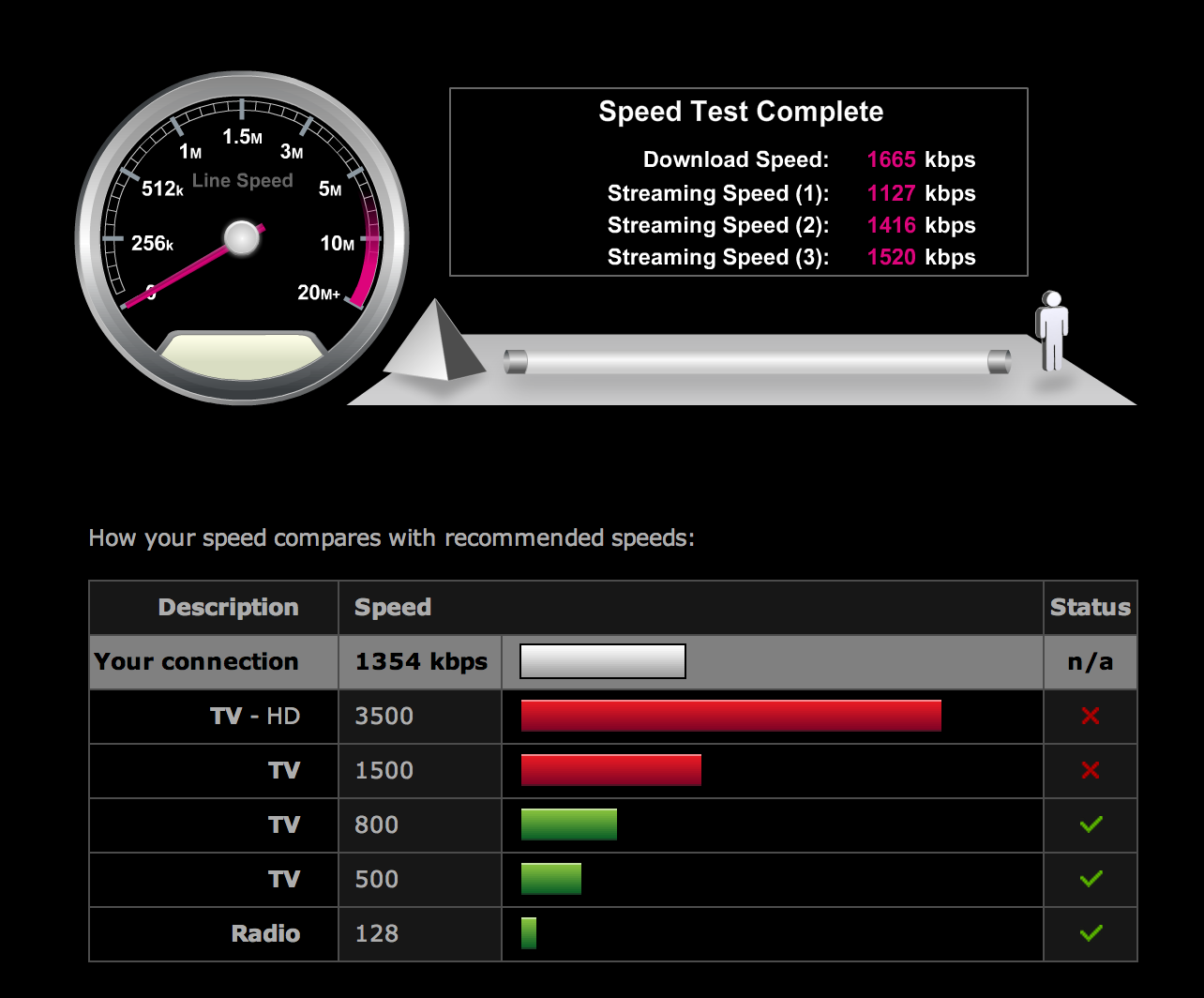
Ignoring the questionable pyramid chartjunk, there are a bunch of issues here — the use of arc length and exceedingly inconsistent scale on the skeuomorphic gauge, the strange choice of colouring on the comparison bars (is green good and red bad? or better/worse than my connection?) and the totally useless “status” column add up to a confusing graphic.
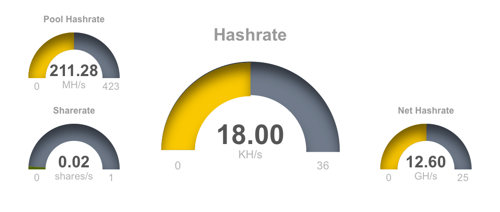
The next is this set of dials from pool.dogechain.info — again the use of arc length is unnecessary, and very few comparisons are possible. At first, the scales look fairly sensible — perhaps the maximums are pool maximums, or averages or something?
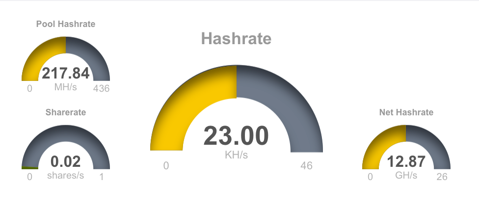
Uh, apparently not.
These dials are always half full. They use up hundreds of pixels of colour and drop shadow, taunting you into thinking you’re getting some sort of useful comparison, when actually they’re informing you that two times twenty three is forty six. Astonishing.
Simply erasing the colour creates a much cleaner graphic
which can be further improved by clearing some of the resultant whitespace

The addition of time-series data might make a genuinely useful contribution, as could some comparisons or proportions allowing your rate to be compared to the pool average or total.
Another welcome, and obvious addition would be “how much do I make per second/minute”, “how much have I made so far”, “how does that compare to other miners” and “how much is that in real money” — these are the questions that I as a miner actually want answered when looking at a dashboard, but the few relevant statistics which are shown are relegated to a small corner.
Understandable and Confusing Design

This treble recorder is an example of understandable design. For various reasons it’s separated into three parts and has to be assembled before usage, but a consistent decrease in diameter and significantly differently sized joints for both ends leave no ambiguity about how it should be assembled.
On their own the parts are unbalanced with exposed unpolished joints. Assembling the instrument creates a balanced, visually consistent object, and a sturdy interference fit gives the user extra confidence that the device is ready for use.

This Icelandic bus timetable is an example of confusing design, due to the inconsistent usage of colour and direction. The grids of times must be read top to bottom then left to right, contrary to most western languages. The yellow blocks (expressing at what intervals between the given times each bus leaves) are not strongly associated with the durations above them, and from a distance, the pairs look much like times themselves.
Udacity’s Design of Everyday Things course is finally available! udacity.com/course/design101 Perfect filler for the long xmas journeys ahead. It’s been too long since I last took part in a #MOOC
en.riff.is is an excellent example of why device testing is an important part of responsive design (try using it at iPad screen size)
Aaron Parecki how about something like this?
Bar Chart Crimes: offsetting bars from the x axis:
Playing with trying to show bus timetable intervals:
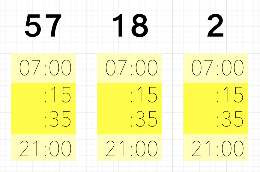
Where the number at the top is the (contrived) bus number, the numbers in pale yellow are the hours between which the bus operates and the numbers in stronger yellow are the intervals at which the bus visits the station. An attempt to improve on the original (not pictured).
Experimenting with photo-generated colour palettes: http://waterpigs.co.uk/colours.html
| #222211 | #4B4841 | #B3BCBB | #CDD7D6 |
| #698A22 | #99cc44 | #aaff77 | |
| #446688 | #6699BB | #aabbee |
I just sent a support email to @github making the following request for better 404 pages:
Your 404 pages are pretty but useless for actually trying to find stuff which is misspelt, moved or gone. Could you consider implementing some of these improvements?
- Show the github header on the 404 page for consistency
- If the path is /real-username/missing-project, show the user’s profile and a list of their repos
- If the path is /missing-username/*, show a search for “missing-username” or at the very least prefill the search box with that text
- Keep track of projects which have moved and do HTTP redirects to their new locations
Thanks for all the great work you’ve done and made possible,
Barnaby
Archived here for posterity and public commentary.