Wondering if @georgelakoff has seen this amazing interactive metaphor map? mappingmetaphor.arts.gla.ac.uk
Visualising music with a spreadsheet:

Graph showing anticipated success of silly plans in DnD:

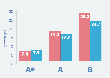
#dataviz rule of thumb: you should still be able to see the shape of the data (if not magnitude) with all the numerals removed.
These #wikipedia visual timelines of composers are quite beautiful: https://en.wikipedia.org/wiki/List_of_classical_music_composers_by_era. I’d love to make a continuous, richer one with sheet music, instruments, other relevant events, portraits, composers identified by country
Looks like Libre Office is the way to go. Thanks @jukesie @robchamberspfc @sophiedennis @w03_
Anyone know how to open XLS files from census.gov on OS X? Tried Numbers, Google Drive, pandas, changing extension to xlsx but all complain about corrupt files. Specifically I want to get at https://www.census.gov/hhes/www/cpstables/032014/perinc/pinc09_000.htm #help
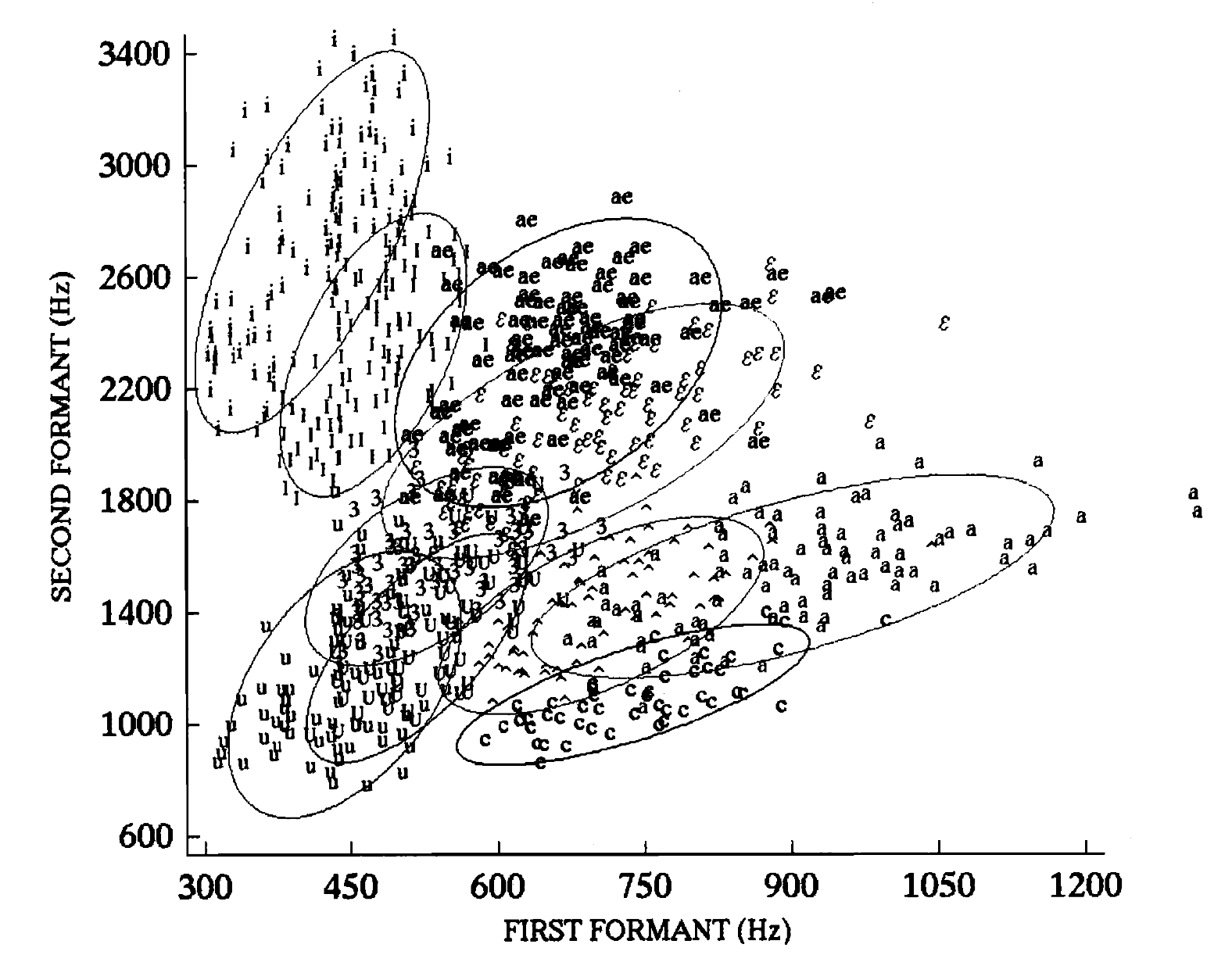
Beautiful chart plotting first+second formants of vowels:
Bad Gauge Design
Compilation of some sub-optimal gauge design I’ve come across recently. First up is BBC iPlayer’s speed tester+comparison tool:
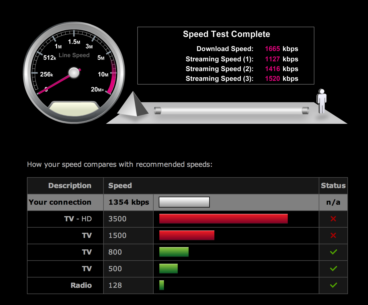
Ignoring the questionable pyramid chartjunk, there are a bunch of issues here — the use of arc length and exceedingly inconsistent scale on the skeuomorphic gauge, the strange choice of colouring on the comparison bars (is green good and red bad? or better/worse than my connection?) and the totally useless “status” column add up to a confusing graphic.
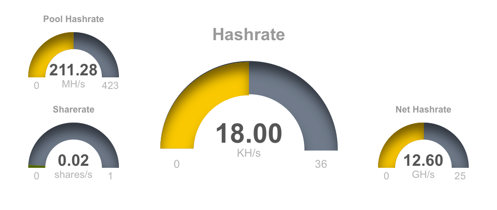
The next is this set of dials from pool.dogechain.info — again the use of arc length is unnecessary, and very few comparisons are possible. At first, the scales look fairly sensible — perhaps the maximums are pool maximums, or averages or something?
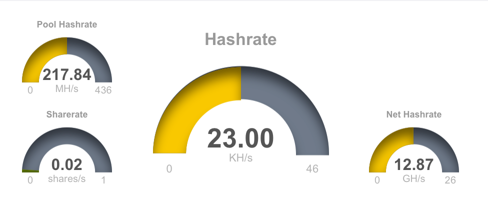
Uh, apparently not.
These dials are always half full. They use up hundreds of pixels of colour and drop shadow, taunting you into thinking you’re getting some sort of useful comparison, when actually they’re informing you that two times twenty three is forty six. Astonishing.
Simply erasing the colour creates a much cleaner graphic
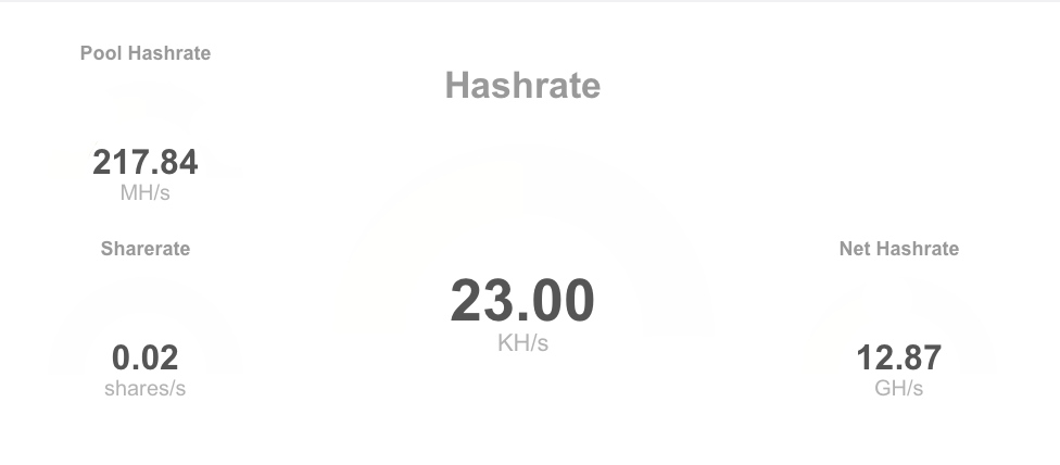
which can be further improved by clearing some of the resultant whitespace

The addition of time-series data might make a genuinely useful contribution, as could some comparisons or proportions allowing your rate to be compared to the pool average or total.
Another welcome, and obvious addition would be “how much do I make per second/minute”, “how much have I made so far”, “how does that compare to other miners” and “how much is that in real money” — these are the questions that I as a miner actually want answered when looking at a dashboard, but the few relevant statistics which are shown are relegated to a small corner.
#idea: use Chernoff Faces to encode PGP key fingerprints. They could be placed unobtrusively on business cards or websites and in email clients, enabling quick, accessible comparison.
Found this interesting piece of #dataviz from my GCSE Geography project whilst digging through site archives whilst trying to fix some dead URLs:
Apart from the obvious flaw of hard-to-read text, and the more subtle distortion of the results due to them being overlaid onto a contoured 3D landscape, it’s actually not that bad.
Working on iOS diagnostics dataviz tool for 30mins and I’ve contributed to an open source project. I have a good feeling about this.
 Barnaby Walters
