1. A Confusing Signifier Corrected: Nutrition Information

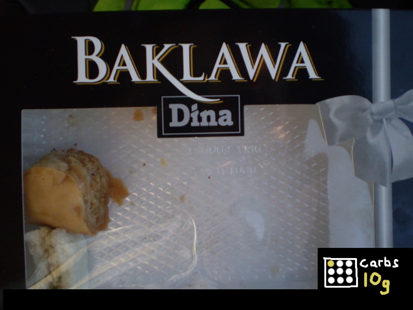
    The nutrition information given on this packet of delicious Baklawa is a confusing and badly designed signifier. Take the example of someone with Type 1 Diabetes who needs to carb count their meals. They have to look on the back of the box

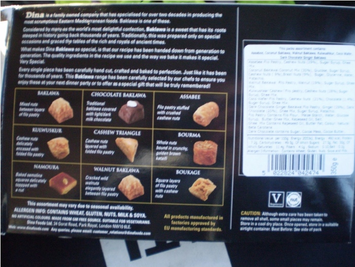
    and peer at a badly printed label with hideous typography and punctuation

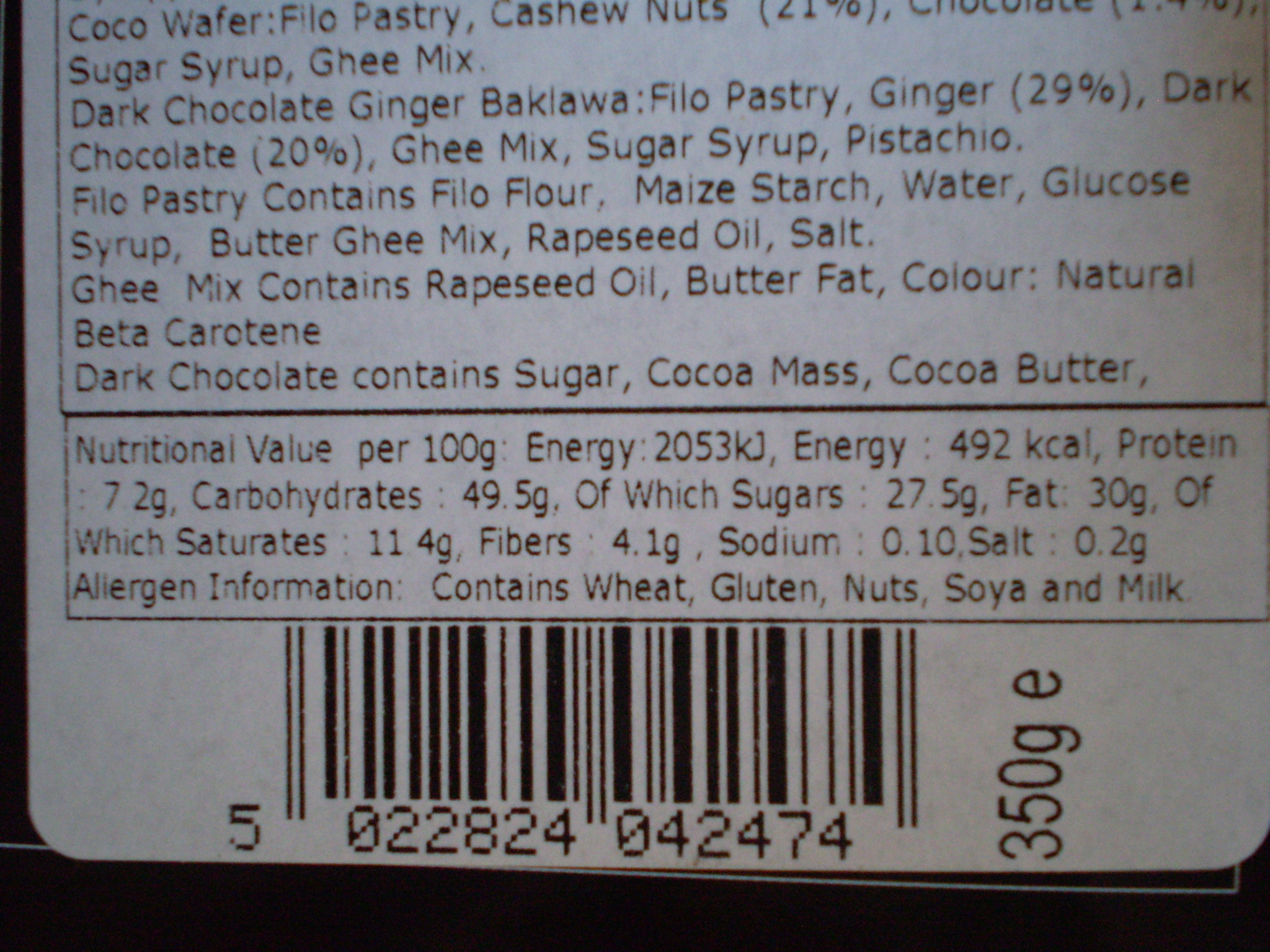
    only to be rewarded with a value of 49.5g per 100g of serving. Turning the box sideways informs us that there’s approximately 350g total.

    Despite the obvious difficulty of accessing the information (especially, say, in low light at a family dinner), there’s a more subtle problem here — that whilst the quantities given are perfectly valid and probably over-precise, the frames of reference and comparison (“per 100g out of a 350g packet”‚ don’t match up in any way to the eater’s mental model of the packet, which looks something like this:

    the entire box is considered as a frame of reference, and each individual baklawa is a single unit.

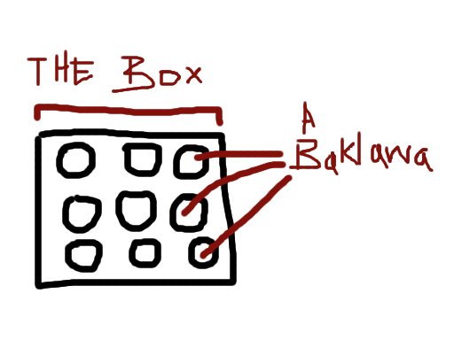
    In practice, no-one eats an entire box of Baklawa, so the only unit which is meaningful to the eater is the per-Baklawa carbohydrate count, which could be expressed clearly and concisely on the packet

    with a small graphic representing the packet, with one item within highlighted in a colour, and the per-item carb count next to the graphic in the same colour.

    This could be placed on the front or the back, that’s not important — what is important is making it robustly readable in varied conditions, and matching the user’s cognitive model to minimise effort spent decoding the information.

    Because people with diabetes shouldn’t have to do maths as a punishment for enjoying Baklawa.

  2. The medium with which you choose to express a message shapes that message — be careful it doesn’t contradict it.

    Case in point: A Rational Web Platform (via @brucel)

    • hosted on google silo
    • long complex ugly URL
    • presentation tied to paged dead-tree media with ugly results: text breaks across artificial “pages”
    • no author URL, just corporate silo email, and email != web
    • javascript required
    • no microformats2 or even semantic HTML article markup — even js-generated markup is predictably disgusting with vast quantities of nested divs and spans with inline styles
    • Redirecting to different (non-canonical? difficult to tell due to ugliness) URL due to large amounts of traffic, likely indicative of infrastructural problems or incorrect medium
    • Broken on mobile devices:
      the body text is tiny and does not wrap, the high-traffic warning is truncated and unreadable

    Everything about this is anti-web, practically screaming “ignore me”.

    Improvements:

    • Host on personal site or project commons with CC license
    • Short, consistent, readable URI
    • Static semantic HTML with microformats2 h-entry for easy citations, archival and replying, no JS required — this would also solve infrastructural problems as HTML is pretty easy to serve and much faster than JS-rendered DOM-heavy “documents”applications
    • Author attributed by name+personal (non-silo) URL, with profile photo/logo for quick human association
  3. Bad Gauge Design

    Compilation of some sub-optimal gauge design I’ve come across recently. First up is BBC iPlayer’s speed tester+comparison tool:

    A circular gauge indicates line speed, speed test results are shown in a table above a graphic of a pyramid, a tube and a small stick figure. Below a table is shown comparing your speed to various reference speeds including HD TV, TV, TV, TV, and radio.

    Ignoring the questionable pyramid chartjunk, there are a bunch of issues here — the use of arc length and exceedingly inconsistent scale on the skeuomorphic gauge, the strange choice of colouring on the comparison bars (is green good and red bad? or better/worse than my connection?) and the totally useless “status” column add up to a confusing graphic.

    A series of semicircular yellow gauges show a hash rate of 18 kilohashes per second, a pool hashrate of 211 megahashes per second, a share rate of 0.02 shares per second and net hashrate of 12.60 gigahashes per second

    The next is this set of dials from pool.dogechain.info — again the use of arc length is unnecessary, and very few comparisons are possible. At first, the scales look fairly sensible — perhaps the maximums are pool maximums, or averages or something?

    An identical series of semicircular gauges is shown with different numbers but all still half-full

    Uh, apparently not.

    These dials are always half full. They use up hundreds of pixels of colour and drop shadow, taunting you into thinking you’re getting some sort of useful comparison, when actually they’re informing you that two times twenty three is forty six. Astonishing.

    Simply erasing the colour creates a much cleaner graphic

    which can be further improved by clearing some of the resultant whitespace

    The addition of time-series data might make a genuinely useful contribution, as could some comparisons or proportions allowing your rate to be compared to the pool average or total.

    Another welcome, and obvious addition would be “how much do I make per second/minute”, “how much have I made so far”, “how does that compare to other miners” and “how much is that in real money” — these are the questions that I as a miner actually want answered when looking at a dashboard, but the few relevant statistics which are shown are relegated to a small corner.

  4. Just watched The Hunger Games for the first time. Initial impressions are that my imagined versions of Haymitch and Snow are way better than the actors. Their Snow is far too old and beardy. Other than that it’s not too bad at all. Looking forward to the next ones.