The Flex’s long battery life, water resistance and sleep tracking allows it to stay on my wrist pretty much constantly, meaning I never forget to put it on. Their web UI is quite nice, and the syncing process is adequate. It’s stupid that the only get at the data on the device is to sync with an iDevice or upload it to their silo and look at (admittedly rather nice) graphs, but that’s a known bug with these devices (which Aaron Parecki has written at length about.)
The Fuelband can be quite painful to put on if the catch pinches skin, its display is nice, and the fact that it doubles up as a watch which automatically syncs timezone with my computer is pretty great. Their web UI is fairly horrible (doesn’t work at all on Firefox due to JS errors), complete with Nike product advertising and confusing comparison charts.
“Nike Fuel” is a singularly useless unit. I’m imagining the reasoning behind it was something like this:
- Our USP is measuring “all kinds of activities” instead of just steps
- Calories would express this just fine, but we can’t trademark something which already exists, or copyright numbers, and database rights (which might not even cover this — ?) only exist in Europe
- Let’s come up with some new unit which is incompatible with our competitors’ products! In order for it to mean anything to anyone, they’ll have to be able to compare their score with other peoples scores, meaning they have to buy Nike products too!
If this is true, I question Nike’s motives — helping people become more active or using vendor lock-in and social manipulation to sell as many devices as possible.
Obviously it’s the second one, but Fitbit exhibit no such problems and seem to be doing okay. Everything is relative.
Both devices are rubbery wrist straps which can make clothing a little bothersome, but presumably that positioning helps them gain more accurate results as opposed to, say, a belt clip.
I’ve been unable to adequately compare the accuracy of either product. The Fuelband seems to think I’ve done far fewer steps than the Flex, but as I can’t get numbers off the Flex quickly it’s difficult to compare the two. One way would be to actually count how many steps I do one day, and see which device is closer.
I’m looking forward to continuing to use both devices, hopefully beginning to follow in Aaron’s footsteps (no pun intended) and pull the data in to my own site.
#qs #fitbit #fuelband

 Anna Debenham
 Glenn Jones
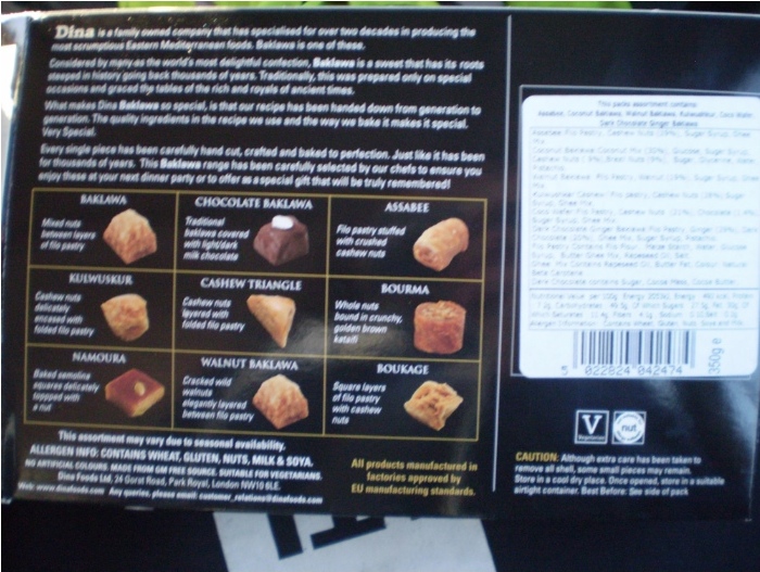


 Ben Werdmüller